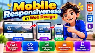
Mobile Responsiveness in Hindi | Responsive Web Design, CSS Media Queries और HTML Tutorial
Description: क्या आप सीखना चाहते हैं कि एक Website को Mobile, Tablet, Laptop और Desktop पर सही तरीके से कैसे दिखाया जाता है? इस वीडियो में Mobile Responsiveness और Responsive Web Design को आसान हिंदी भाषा में Practical HTML और CSS Examples के साथ समझाया गया है।
आज के समय में Website बनाते समय केवल Desktop Layout तैयार करना पर्याप्त नहीं है। Website का Design अलग-अलग Screen Sizes पर सही दिखाई देना चाहिए, Text आसानी से पढ़ा जा सके और Buttons तथा Navigation का उपयोग सरल हो। इसी उद्देश्य को पूरा करने में Mobile Responsiveness महत्वपूर्ण भूमिका निभाती है।
📚 **इस वीडियो में आप क्या सीखेंगे?**
🔹 Mobile Responsiveness का परिचय और परिभाषा
🔹 Responsive Web Design क्या है
🔹 Responsive Website कैसे काम करती है
🔹 Desktop, Tablet और Mobile Layout में अंतर
🔹 Viewport Meta Tag का उपयोग
🔹 CSS Media Queries क्या हैं
🔹 CSS में Breakpoints का उपयोग
🔹 Flexible Layouts और Fluid Grid
🔹 Responsive Images बनाने की तकनीक
🔹 Mobile-Friendly Navigation Menu
🔹 Mobile-First Design Approach
🔹 Responsive Typography और Touch-Friendly Buttons
🔹 HTML और CSS के Practical Examples
🔹 Responsive Website के लाभ और सीमाएँ
🔹 Website को अलग-अलग Screen Sizes पर Test करना
🔹 Mobile Responsiveness याद रखने की आसान Memory Trick
💻 **Mobile Responsiveness क्यों जरूरी है?**
मान लीजिए आपने एक Educational Website बनाई है, जिसमें Computer Courses के Notes और Tutorials उपलब्ध हैं। Desktop पर तीन Columns में Content दिखाई देता है, लेकिन Mobile पर वही Content छोटा या अव्यवस्थित दिखाई देने लगता है। Responsive Design की सहायता से आप Layout को इस प्रकार Adjust कर सकते हैं कि Mobile पर Content एक Column में दिखाई दे और Images भी Screen के अनुसार Resize हों।
इस वीडियो में आप Viewport Meta Tag, CSS Media Queries, Flexible Layouts और Responsive Images के उपयोग को समझेंगे। साथ ही जानेंगे कि Mobile-Friendly Website बनाने के लिए Readability, Navigation, Accessibility और Performance पर ध्यान देना क्यों आवश्यक है।
🎯 **यह वीडियो किनके लिए उपयोगी है?**
यह Tutorial DCA, PGDCA, BCA के विद्यार्थियों, HTML और CSS Beginners, Web Designers, Web Developers तथा Responsive Websites बनाना सीखने वाले सभी लोगों के लिए उपयोगी है।
📌 **हमारे चैनल पर सीखें**
HTML, CSS, JavaScript, Web Designing, Web Development, SEO Basics, Website Hosting, Git, GitHub और Digital Marketing जैसे विषय आसान हिंदी में।
वीडियो पसंद आए तो Like करें, दोस्तों के साथ Share करें और ऐसे ही Educational Tutorials के लिए Channel को Subscribe करें। अपने सवाल और सुझाव Comment में जरूर लिखें।
**Hashtags:**
#MobileResponsiveness #ResponsiveWebDesign #CSSMediaQueries #HTMLCSS #WebDesigning #WebDevelopment #MobileFriendlyWebsite #ResponsiveDesign #HTMLTutorial #CSSTutorial #HindiTutorial #ComputerEducation Close description
आज के समय में Website बनाते समय केवल Desktop Layout तैयार करना पर्याप्त नहीं है। Website का Design अलग-अलग Screen Sizes पर सही दिखाई देना चाहिए, Text आसानी से पढ़ा जा सके और Buttons तथा Navigation का उपयोग सरल हो। इसी उद्देश्य को पूरा करने में Mobile Responsiveness महत्वपूर्ण भूमिका निभाती है।
📚 **इस वीडियो में आप क्या सीखेंगे?**
🔹 Mobile Responsiveness का परिचय और परिभाषा
🔹 Responsive Web Design क्या है
🔹 Responsive Website कैसे काम करती है
🔹 Desktop, Tablet और Mobile Layout में अंतर
🔹 Viewport Meta Tag का उपयोग
🔹 CSS Media Queries क्या हैं
🔹 CSS में Breakpoints का उपयोग
🔹 Flexible Layouts और Fluid Grid
🔹 Responsive Images बनाने की तकनीक
🔹 Mobile-Friendly Navigation Menu
🔹 Mobile-First Design Approach
🔹 Responsive Typography और Touch-Friendly Buttons
🔹 HTML और CSS के Practical Examples
🔹 Responsive Website के लाभ और सीमाएँ
🔹 Website को अलग-अलग Screen Sizes पर Test करना
🔹 Mobile Responsiveness याद रखने की आसान Memory Trick
💻 **Mobile Responsiveness क्यों जरूरी है?**
मान लीजिए आपने एक Educational Website बनाई है, जिसमें Computer Courses के Notes और Tutorials उपलब्ध हैं। Desktop पर तीन Columns में Content दिखाई देता है, लेकिन Mobile पर वही Content छोटा या अव्यवस्थित दिखाई देने लगता है। Responsive Design की सहायता से आप Layout को इस प्रकार Adjust कर सकते हैं कि Mobile पर Content एक Column में दिखाई दे और Images भी Screen के अनुसार Resize हों।
इस वीडियो में आप Viewport Meta Tag, CSS Media Queries, Flexible Layouts और Responsive Images के उपयोग को समझेंगे। साथ ही जानेंगे कि Mobile-Friendly Website बनाने के लिए Readability, Navigation, Accessibility और Performance पर ध्यान देना क्यों आवश्यक है।
🎯 **यह वीडियो किनके लिए उपयोगी है?**
यह Tutorial DCA, PGDCA, BCA के विद्यार्थियों, HTML और CSS Beginners, Web Designers, Web Developers तथा Responsive Websites बनाना सीखने वाले सभी लोगों के लिए उपयोगी है।
📌 **हमारे चैनल पर सीखें**
HTML, CSS, JavaScript, Web Designing, Web Development, SEO Basics, Website Hosting, Git, GitHub और Digital Marketing जैसे विषय आसान हिंदी में।
वीडियो पसंद आए तो Like करें, दोस्तों के साथ Share करें और ऐसे ही Educational Tutorials के लिए Channel को Subscribe करें। अपने सवाल और सुझाव Comment में जरूर लिखें।
**Hashtags:**
#MobileResponsiveness #ResponsiveWebDesign #CSSMediaQueries #HTMLCSS #WebDesigning #WebDevelopment #MobileFriendlyWebsite #ResponsiveDesign #HTMLTutorial #CSSTutorial #HindiTutorial #ComputerEducation Close description


